Design tokens and semantic variables (colors, typography, spacing, states, modes) as the core.
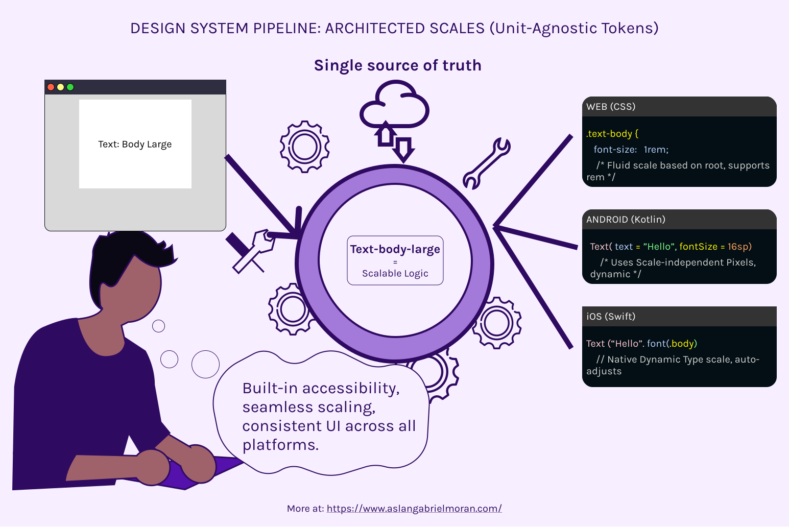
You’re here because your tech product has components and interfaces, but lacks a unified design language and scalable architecture. You want a single source of truth that works across Web, iOS, and Android, eliminates design debt, accelerates development velocity, and makes onboarding new engineers far smoother.
We specialize in UX Architecture and Design Systems for teams that already operate with system-based thinking. You know your direction, value proper research and strategy over quick AI-generated outputs, and understand that great UX requires structure, not just individual effort.
Design tokens and semantic variables (colors, typography, spacing, states, modes) as the core.
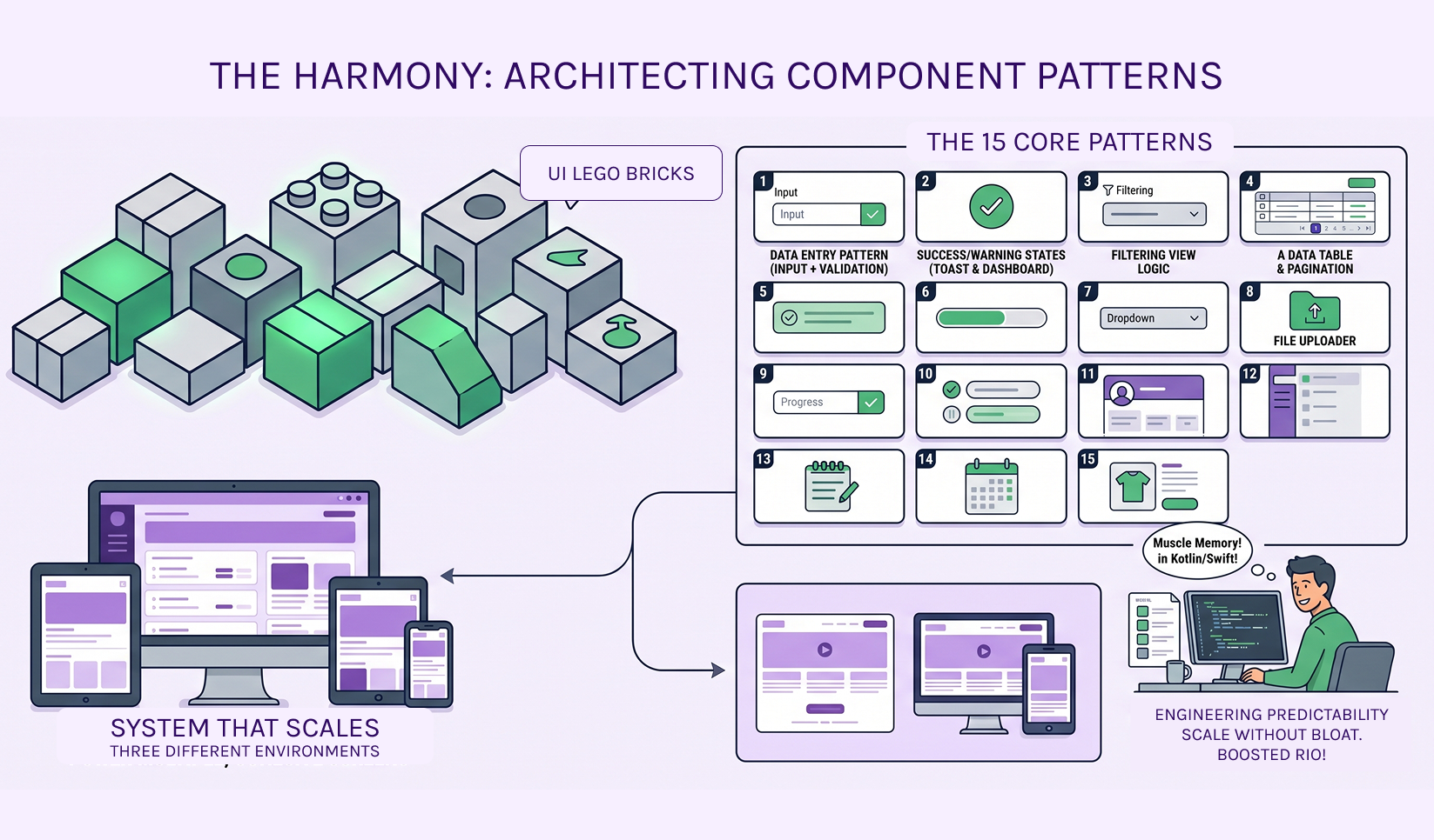
Reusable component logic and patterns, not one-off screens.
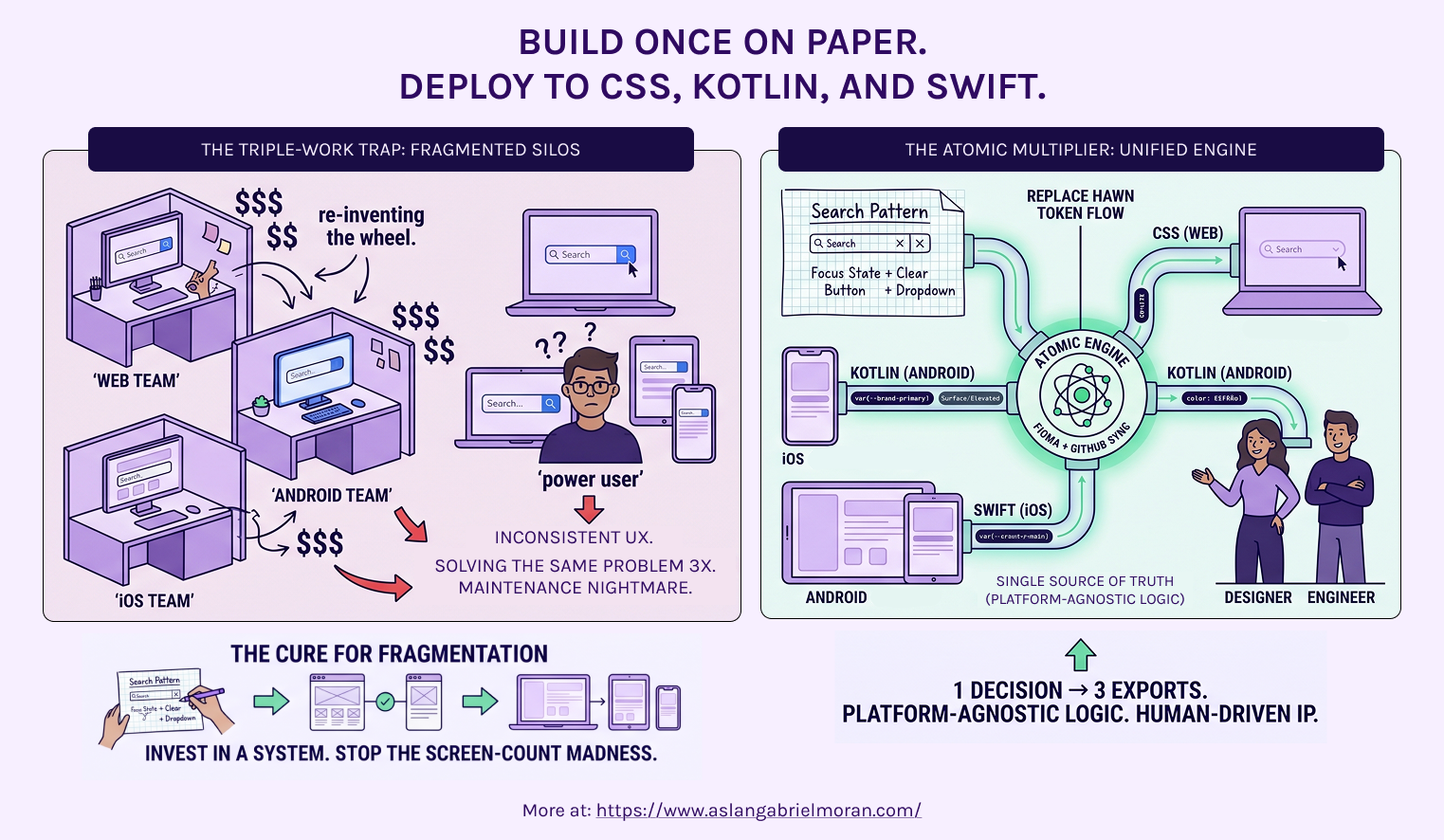
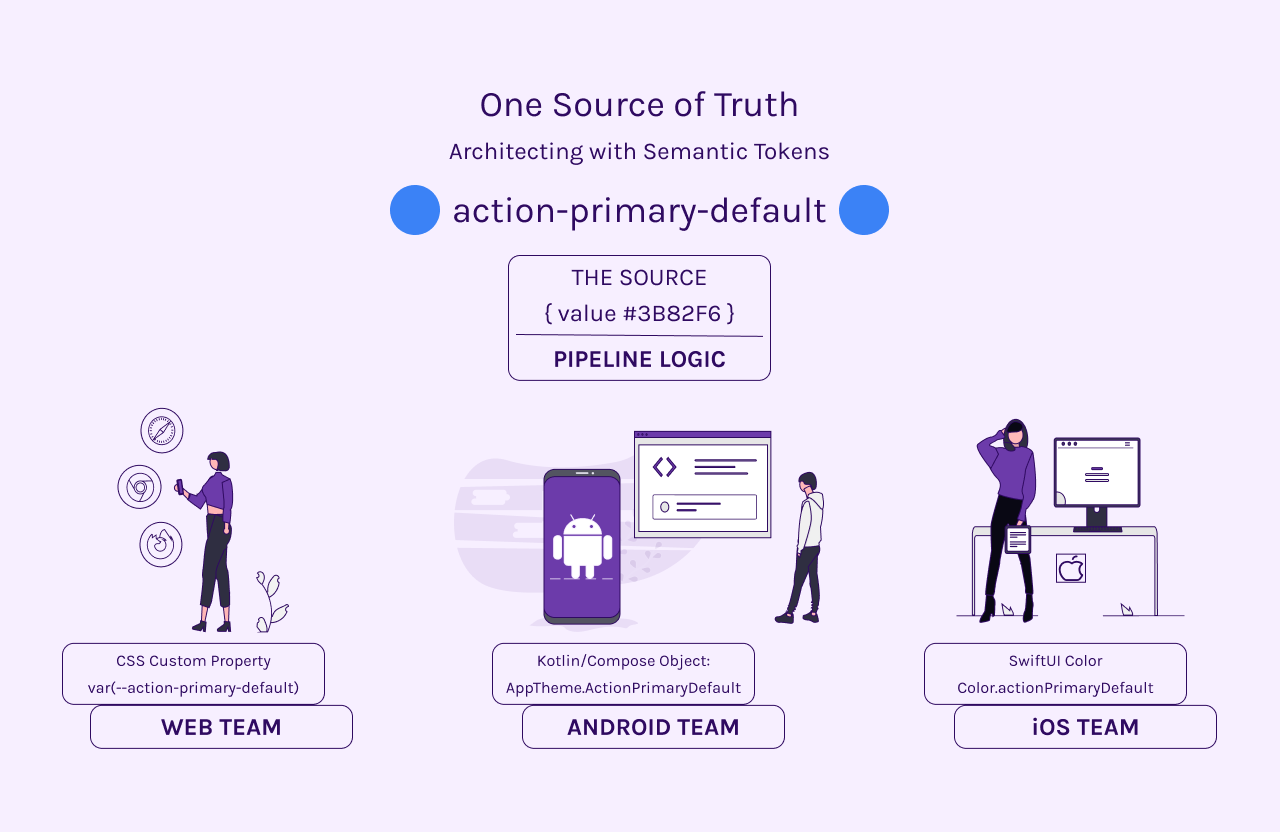
Architecture that translates cleanly: decisions made once propagate to CSS (Web), Swift (iOS), and Kotlin (Android).
Your library of components aren’t copy and paste from other libraries, they're audited depending on your users and business needs, competitors practices, research and industry requirements. We do not just prompt “make a component for this flow. Make no mistakes.” Our work is based on research, understanding, and what you need.
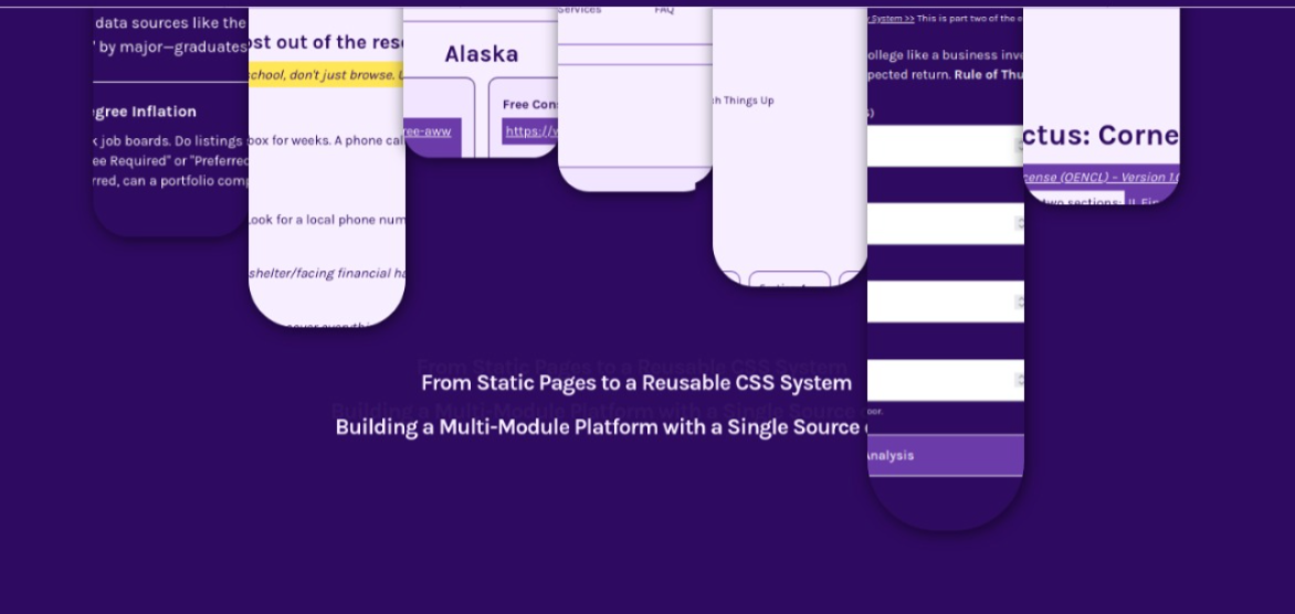
Turning static pages into a reusable CSS system with shared tokens across dashboards, calculators, and workflows.
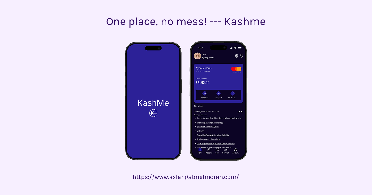
FinTech app enhancements focused on structured, scalable UI.
Velocity & Scale Series topics address common issues like hard-coded values, Figma liabilities, and pattern-based thinking over screen-count growth.
You won’t get pretty mockups alone. You’ll get logic, structure, and system that empower your team to ship faster with consistency.
Teams with system-based architecture and clear direction.

Organizations that prioritize user research, competitor analysis, and strategic UX over shortcuts.

Leaders who want scalable foundations rather than feature-by-feature bandaids.
Review the Velocity & Scale Series and case studies for alignment.
Fill out the Design System Intake Form (linked on services pages) to share your context.
Reach out via the contact form below for an initial discussion.
We only take on projects where we can deliver meaningful structural impact. If your team is ready to move from fragmented components to a true design language, let’s build the foundation.
Ready to de-risk your UI and scale with clarity? Submit our Design System Intake >> form.
Navigation Tips