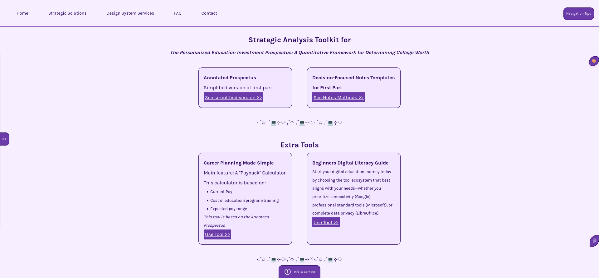
Career Planning Made Simple
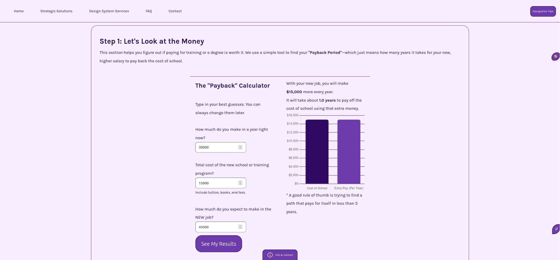 Calculate
training program
>>
Calculate
training program
>>
This project demonstrates how a CSS-based system can scale across multiple modules while maintaining consistency, reusability, and structural clarity—without relying on hard-coded values or isolated components.
The platform contains multiple structured sections (dashboards, calculators, resource libraries, and guided workflows), all powered by a shared design system.
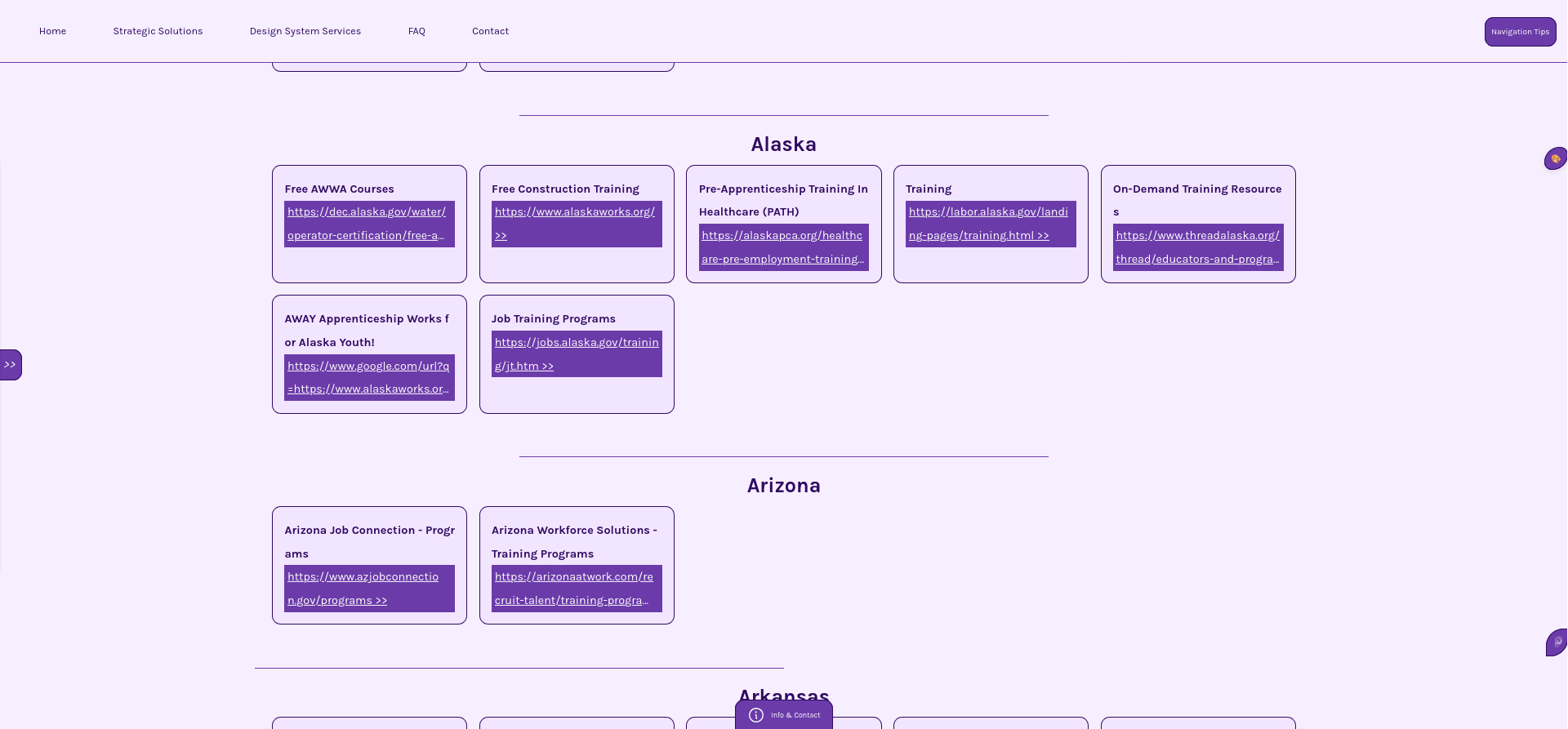
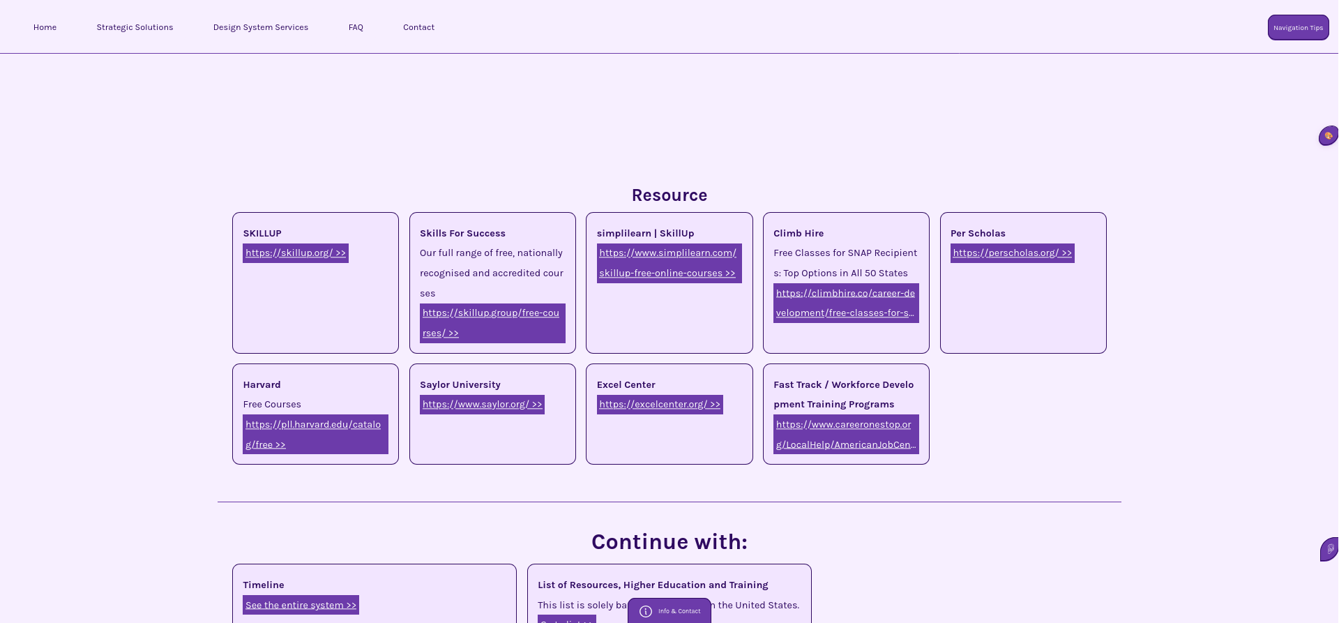
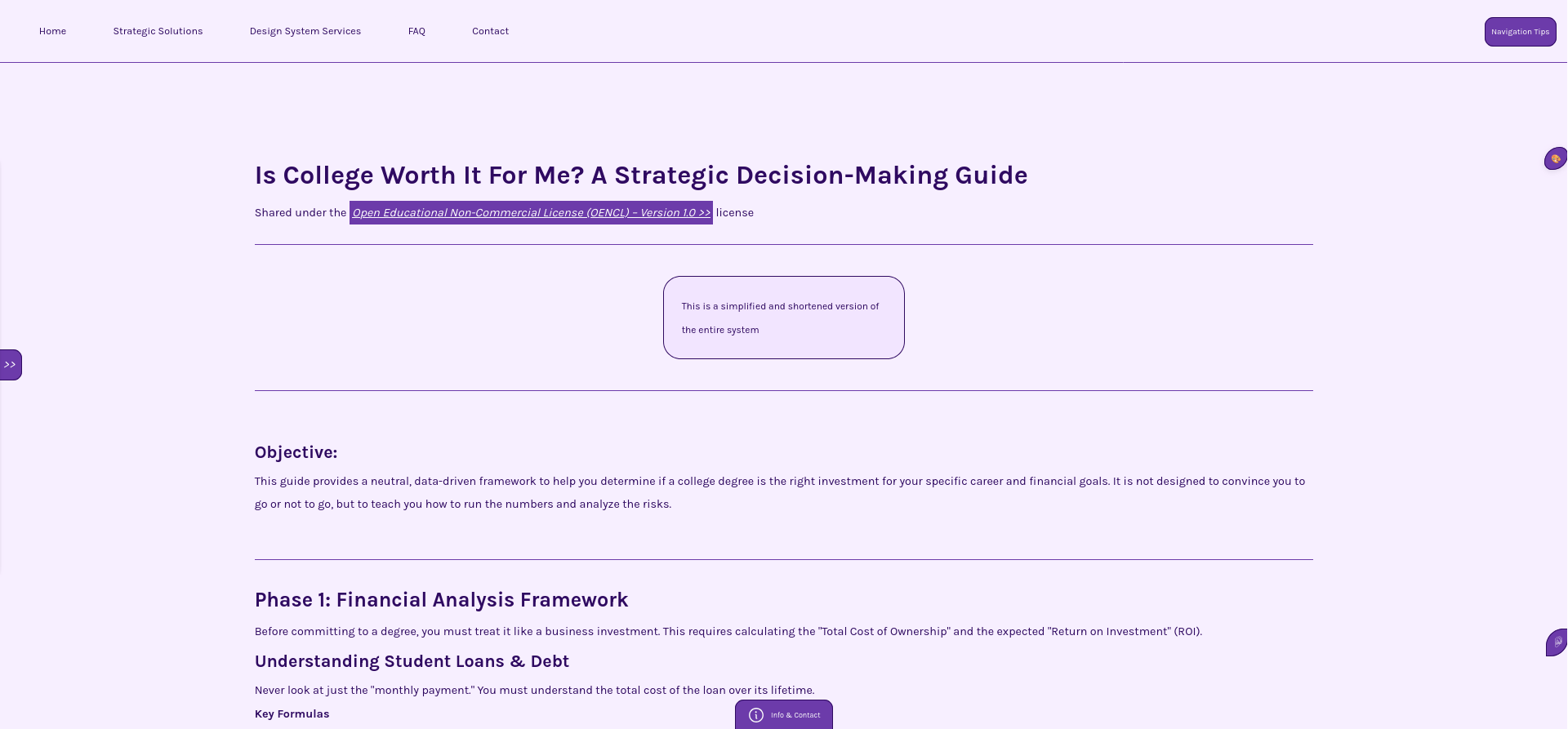
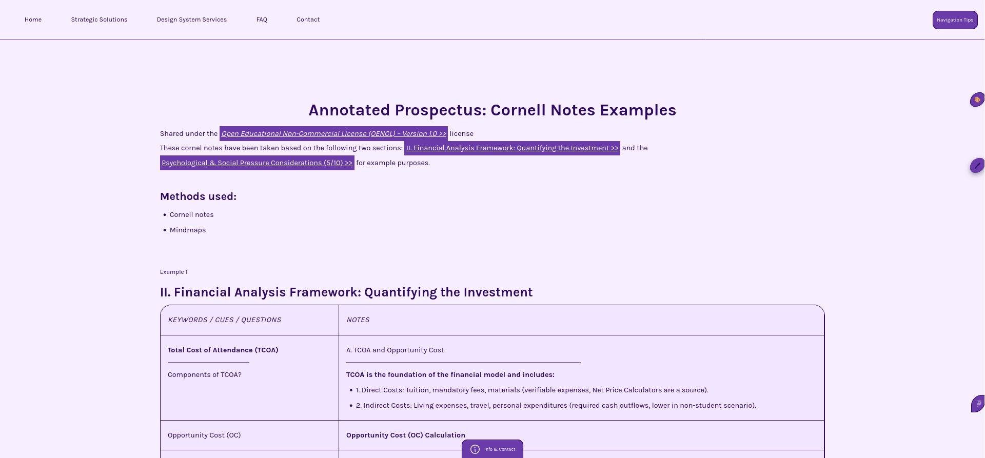
The platform required supporting multiple content-heavy modules:
Calculate
training program
>>
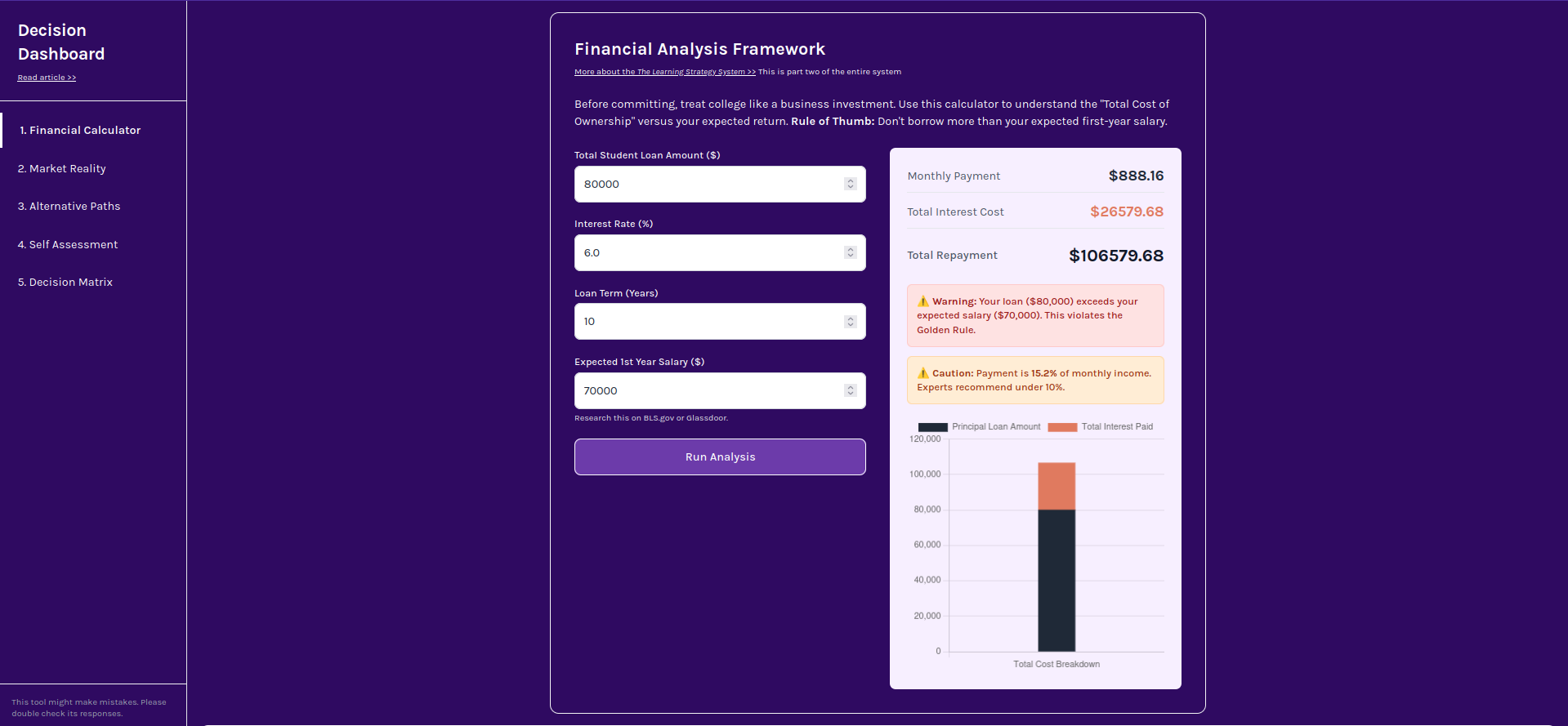
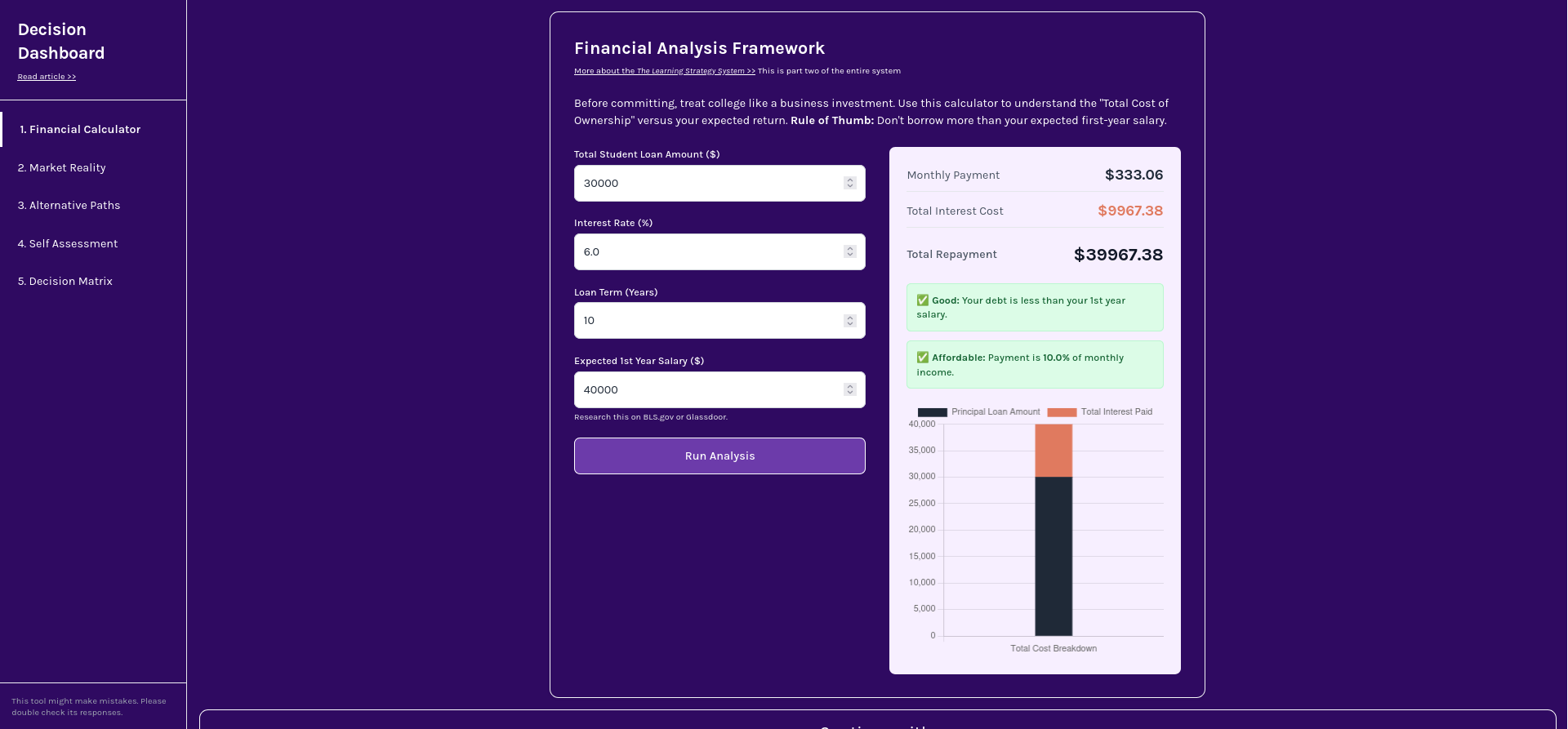 Calculate
student loan PR >>
Calculate
student loan PR >>
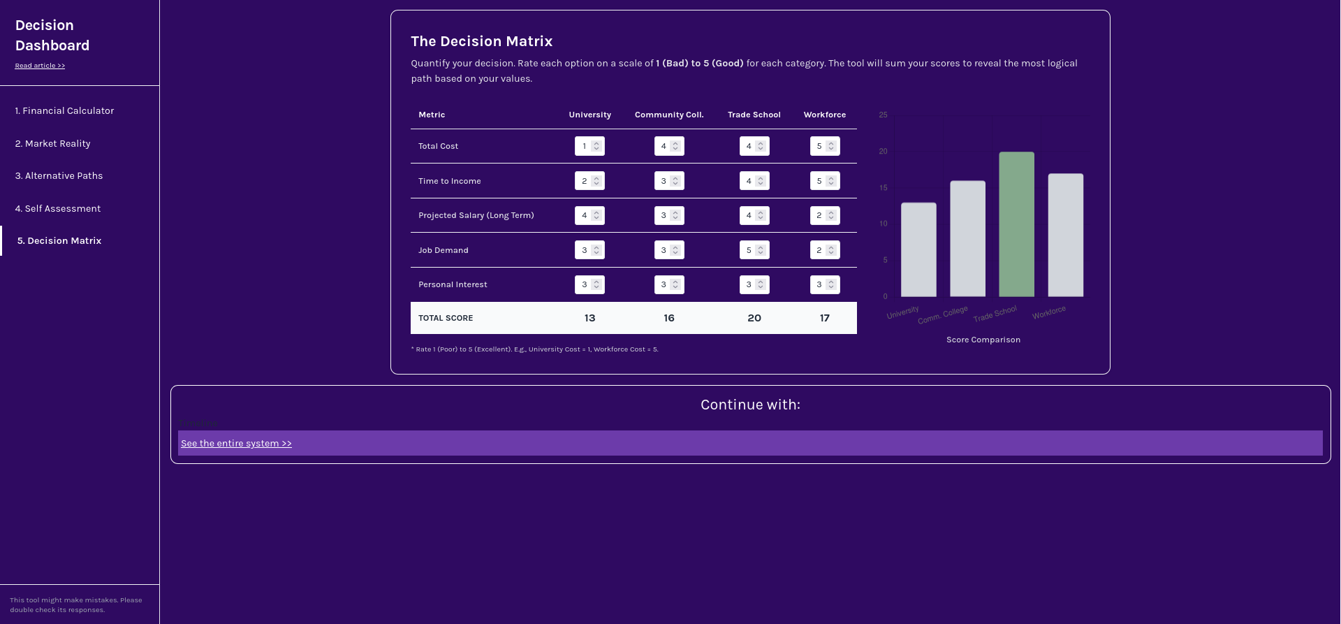 Try The
Decision Matrix >>
Try The
Decision Matrix >>
Without a system, this would result in:
This is a common failure point in scaling SaaS products—where UI grows faster than system logic.
The system was intentionally built using CSS-only architecture, without relying on external frameworks.
This constraint was used to validate:
All UI elements were built using shared rules:
The logic used on the Learning Strategy System is used here as well - Try changing the theme here! while clicking the available options under the button shown bellow.
 This is an image, click button on the top right below "Navigation
tips"
This is an image, click button on the top right below "Navigation
tips"
The architecture follows a clear hierarchy:
Each layer builds on top of the previous without breaking consistency.
Proof of Scale
The system supports multiple distinct modules, including:
These were not designed independently.
All modules:
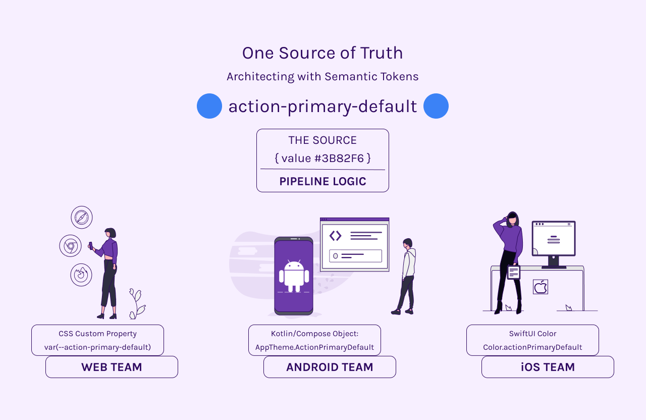
While this system was implemented in CSS, the architecture is platform-agnostic.
The same logic can translate into:
This enables a “one decision → multiple platforms” model without redefining design logic.
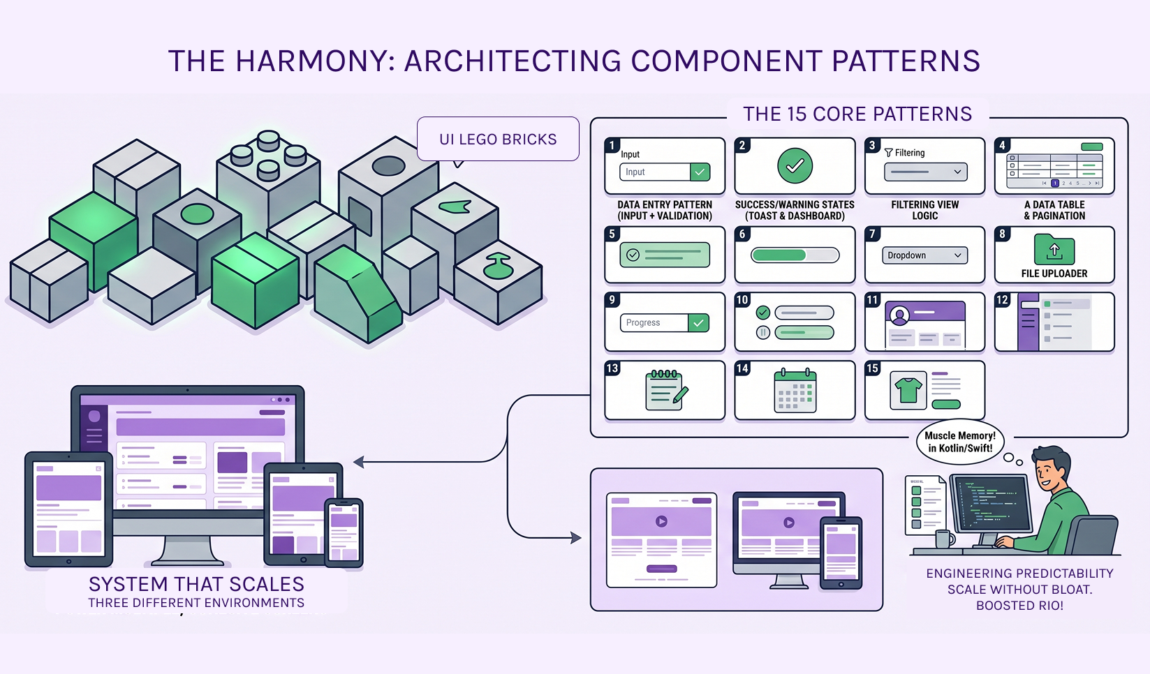
The core shift in this project was not visual—it was structural.
Instead of designing pages:
→ The system was designed as a set of reusable decisions
→ Components consume variables, not static values
→ Modules inherit logic, not styles
This approach transforms the UI from a collection of screens into a scalable system.
Originally developed as a UX-driven platform for career and education decision-making, this system evolved into a structured environment for handling complex, high-stakes user flows.
It includes:
The complexity of this content made it an ideal test case for validating a scalable design system.
This project demonstrates how a constrained, CSS-only system can scale across complex modules while maintaining consistency, reusability, and clear structural logic—mirroring the same challenges faced by growing SaaS platforms.
Navigation Tips